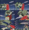
QUALITY
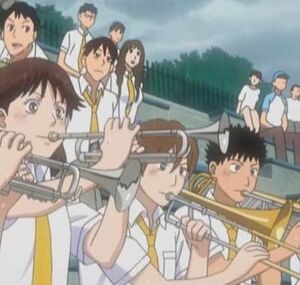
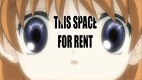

Originated from /a/, QUALITY images refers to screenshots/pictures in anime or manga that are horribly substandard. They are usually the product of shitty "in-between" animation (or shots that transition from key frame to key frame) or the farming out to cheap third party animators or artists. Usually, the clearest indicators of QUALITY are characters who are drawn off-model, with distorted eyes, choppy and/or inconsistent animation sequences and facial distortions (when unintended to be a gag). Intentional "face faults" used to emphasize gags and humor are not QUALITY, but beyond that the defnintion of the term is not clear.
There's no brink for determining whether or not something is QUALITY, meaning ugly artwork just becomes whatever a viewer doesn't like. Some /a/ssholes have taken QUALITY to just mean "shitty" artwise, plotwise or in general, rather than specifically shitty animation, and cyclical shitstorms occur when Anonymous argues over the technicalities and criteria for the definition of this term.
/a/ usually blames GONZO for the proliferation of QUALITY in recent anime, since they were the first studio to start cutting corners during production. A fine example of QUALITY is Musashi Gundoh and many scenes in Higurashi no Naku Koro ni, though The Cabbage is often seen as the most coveted instance of QUALITY ever. Curiously, the all-female manga group CLAMP often draws "noodle people" with unusually long limbs and lanky bodies as an intentional part of their art style, which are often considered QUALITY by those who dislike the unrealistic proportions. Even usually well drawn and animated shows sometimes have moments of QUALITY caused by blowing the budget on amazing animation and effects in other episodes.
Terms of QUALITY
PROPORTIONS
Common protest against bad or exaggerated anatomy (see for example Code Geass and other CLAMP works).
- See: PROMOTIONS
ASPECT RATIO
Not related to Raito from Death Note. Commonly yelled as protest against bad aspect ratio (duh) of screenshots. Often caused by taking a 16:9 screenshot and saving it as 4:3, or by assuming that DVDs have square pixels (the former produces worse results than the latter). Aspect ratio differences between different TV channels have also known to make the effects on nutbladders worse or better, depending on your perspective.
PERSPECTIVE
Bad perspective. I think you get the picture now.
IMAGE QUALITY
You don't get the picture.
Examples of QUALITY
Assorted
-
?
-
?
-
?
-
?
-
Long legs are loooooong.... (xxxHolic)
-
Dragonball Z
-
Sonic X characters look stupid enough without animators making them look worse.
-
? Oh dear Lord.....
-
? Ah ha ha, oh wow....
-
Edward from Fullmetal Alchemist
-
?
-
? Damn, that's a big bike. .....Or a small street.....
-
?
-
?
-
?
-
? Because that's how faces work.
-
? Look at the chair.
-
? That's seriously how they drew the people.
-
? We're pretty sure this was meant to be fan-service. The artist intended for you to be aroused by this.
-
? Ahhhhh! It's a fucking giant!
-
?
-
?
-
/co/-material has plenty of QUALITY as well. This is J. Jonah Jameson from 60s Spider-Man.
-
?
-
And this is the most handsome character in the Yu-Gi-Oh series...
Bleach
-
Good Ichigo, you look kind of cool
-
Hands do not work that way....
Ginga Densetsu Weed
These are supposed to be dogs...
Death Note
Higurashi
-
Higurashi was plagued by QUALITY.
Mecha
-
Old-school QUALITY.
-
QUALITY has always been an integral part of the Mobile Suit Gundam franchise.
-
This episode was so bad it isn't even included on DVDs. The series creator says he won't allow it to be included as long he lives, to protect the reputations of the animators.
-
On-model animation is truly a rare sight in Mobile Suit Gundam.
Naruto
-
Sometimes the animation in a series can get so bad that entire body-parts will disappear in frames.
-
The tween-frames in any given episode of Naruto can prove to be hysterical.
-
Naruto perfectly emulates the fluid, fast-paced nature of an authentic ninja-battle.
-
Yeah, totally....
-
So why hasn't Naruto won an award for Best in Animation yet?
-
Seriously? Why hasn't it?
-
My pain...
-
...is far...
-
...greater than...
-
...yourrsssadasfsgkdhl!!!1 (Shippuuden ep. 167)
One Piece
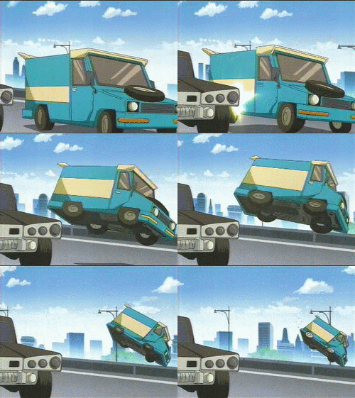
Van
-
More QUALITY Van.
-
Still more QUALITY Van. This time showing a magical change in trajectory.
-
Still more QUALITY Van.


